Down in the Dungeon's Depths
So you may or may not remember a dungeon generator I showed off in a previous blog post - but it's finally time to put it into action!
Basic Beginnings
To start with, it's simply a case of parsing the colours from the dungeon generator into tiles and objects in game! This requires getting the colour of all pixels in the 64x64 image created by the generator, and then checking them against a list to see what they should be. So, in the case of this dungeon generator:
- Blue creates a floor tile
- White creates a wall object, but also a floor tile underneath it
And a couple more not shown in the previous generator:
- Red dictates the spawn point for an enemy, with a 66% chance of spawning. This is almost certain to change during playtesting!
- Orangey brown is where torches spawn
- Light blue spawns an archway object, although that won't be visible until further on in the blog post.

A Shift in Perspective
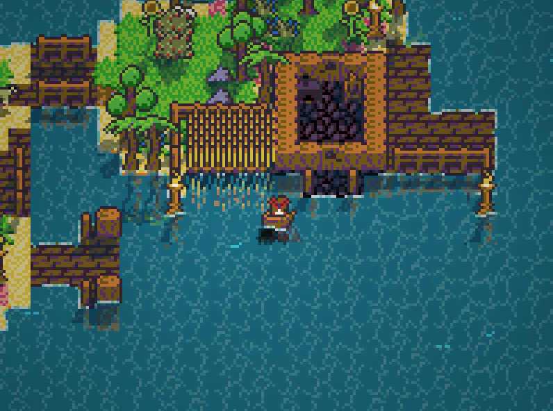
As you've seen previously, the visual perspective of Landraisers is very akin to the older, 2D Zelda games:

However this perspective just didn't look right when it came to the dungeons, they didn't look "grand" enough!

(Test enemies on the left, please ignore! (Or don't it's your choice))
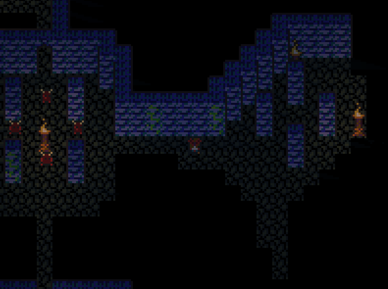
In order to improve the scale of the dungeons, I would have to make the walls taller, but this would create a problem called "I can't see what the heck is going on", so I would also have to remove the lower wall of all rooms. Making the object taller was no issue at all (although it did throw up some lighting issues that I fix later on), but removing the lower walls is harder than it sounds! I cannot simply remove the bottom wall in the room images, as that would cause issues when it comes to rotation. Walls would end up getting deleted on the sides and tops! Instead, I would have to detect whether or not to create the wall during the process of translating the completed dungeon image into the dungeon.

And this is what I came up with! There's still some funkiness in the walls that I obviously didn't show in the image { :^) but for the most part it works well! I then went ahead and added the lighting fixes, and switched the colour of the lights from a white to a nice contrasting orange, added the archways (which only appear on the back walls), a couple more small details... and this is what we have!

Still got a little bit of work to do but they're getting there! I'll leave you to see the final dungeons for yourself :)
There will be multiple different dungeon themes with many different enemies to fight and items to find. I'm currently working on the combat, but this will take a while to get completed so don't expect a combat blog post for a little while! While you're here reading about dungeons, head on over and give me a follow on my dungeon of a Twitter account!
Thanks for reading this week's blog!
Landraisers
| Status | In development |
| Author | Zeritum |
| Genre | Survival, Adventure |
| Tags | Sandbox |
More posts
- Landraisers Early Access47 days ago
- Pre-Beta 1.1.0!Mar 26, 2020
- Pre-Beta 1.0.0!Feb 26, 2020
- Of Burnouts and BetasFeb 15, 2020
- One step at a time!Jan 27, 2020
- Death in Paradise!Jan 13, 2020
- The Combat Blog!Jan 06, 2020
- 2020 Roadmap!Dec 30, 2019
- Unplanned Hiatus!Dec 15, 2019
- Bits and bobs and odds and sodsNov 25, 2019

Leave a comment
Log in with itch.io to leave a comment.